
This is Volume 2 of Examples of Bad UX, a collection of confusing product interfaces, features, and web applications that each of us encounters, unfortunately, too often.
1. Harvard Business Review: unknown password rules.
There are no password requirements rules there. Well, there are, but you will only know what they are (and, also, that you’re already wrong) when you try to submit the form.
There is a simple UX heuristic rule that is forgotten here: Error prevention rather than error recall.


2. Stanford account registration: did I make an error?
I was in the process of creating an account, and I thought I received an error message: the selected username is not available… Turned out it wasn’t an error message, but just a confirmation that I could actually use the name. I wondered if anybody else had a similar confusion. The reason? We all are well trained to react the same way, online or offline: the green color means “Go!” and the red – “Stop!”
The UX heuristics rule that is broken: Match between the system and the real world.


3. F5 Search
I love the company, but I don’t like the search experience on the company’s website. First, the elements are so big you have to scroll to see the results or filters. Second, the results are shown in an overlay dropdown and, if you click on any links in the returned queries, you will lose your search:

Two UX heuristics rules were broken here:
Flexibility and efficiency of use;
Aesthetic and minimalist design.
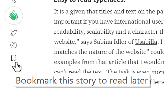
4. Medium’s “Bookmark this story to read later” tooltip.
It’s a minor, but still a little confusing thing I saw on Medium. It doesn’t matter if you have clicked on the little icon or not – the tooltip still prompts you to bookmark it:

5. “Oddfellows” cafe website: instructions to click on the menu to view the menu.
If an element of your interface requires instructions, then you need to redesign it. — Dan Rubin
Look at the menu page here. Does the list on the right look like a menu? You would probably not guess it, so owners added instructions for visitors: “Click below to view menus.” Would it be a better solution to design this list with obvious links, and maybe style it, so it looks like navigation?

6. Youtube channels: trick to get subscribers.
I was watching one of the videos on a Youtube channel and tried to resume it after a pause. Unexpectedly, I got transferred to the channel’s “Subscribe” page. Why? Because I clicked the “Subscribe” button that was placed on the video screen, it was red, and looked exactly like Youtube’s red playback icon.
Tricky design may cause users to click, but won’t get them to proceed with subscription simply because it wasn’t their intention. This design is also considered a “dark design pattern”.
Three UX heuristics rules were broken here:
Error prevention rather than error recall;
Consistency and standards;
Flexibility and efficiency of use.

This post will be continued…
References and suggested reading
- nngroup.com, “10 Usability Heuristics for User Interface Design“. 1995
- Dark Patterns, https://www.darkpatterns.org/