
I’m a UX designer. I’m a user, too.
The first time I had the idea to write a post about examples of really bad UX was a few years ago when I was at a local government office and needed to enter my information into their system. To secure my access I had to select a security question, in my case I choose “Mother’s maiden name”. But when I entered the name I got an error message, saying that my answer was supposed to contain at least one number. It was laughable but sad.
We encounter bad UX every day; it could be a tool we use, or confusing feature, application, website… Bad UX slows us down, prevents us from completing the task, or makes us feel frustrated.
Here are a few examples:
1. Number buttons on the microwave oven.
In my company’s building every kitchen on every floor is supplied with this particular microwave oven:
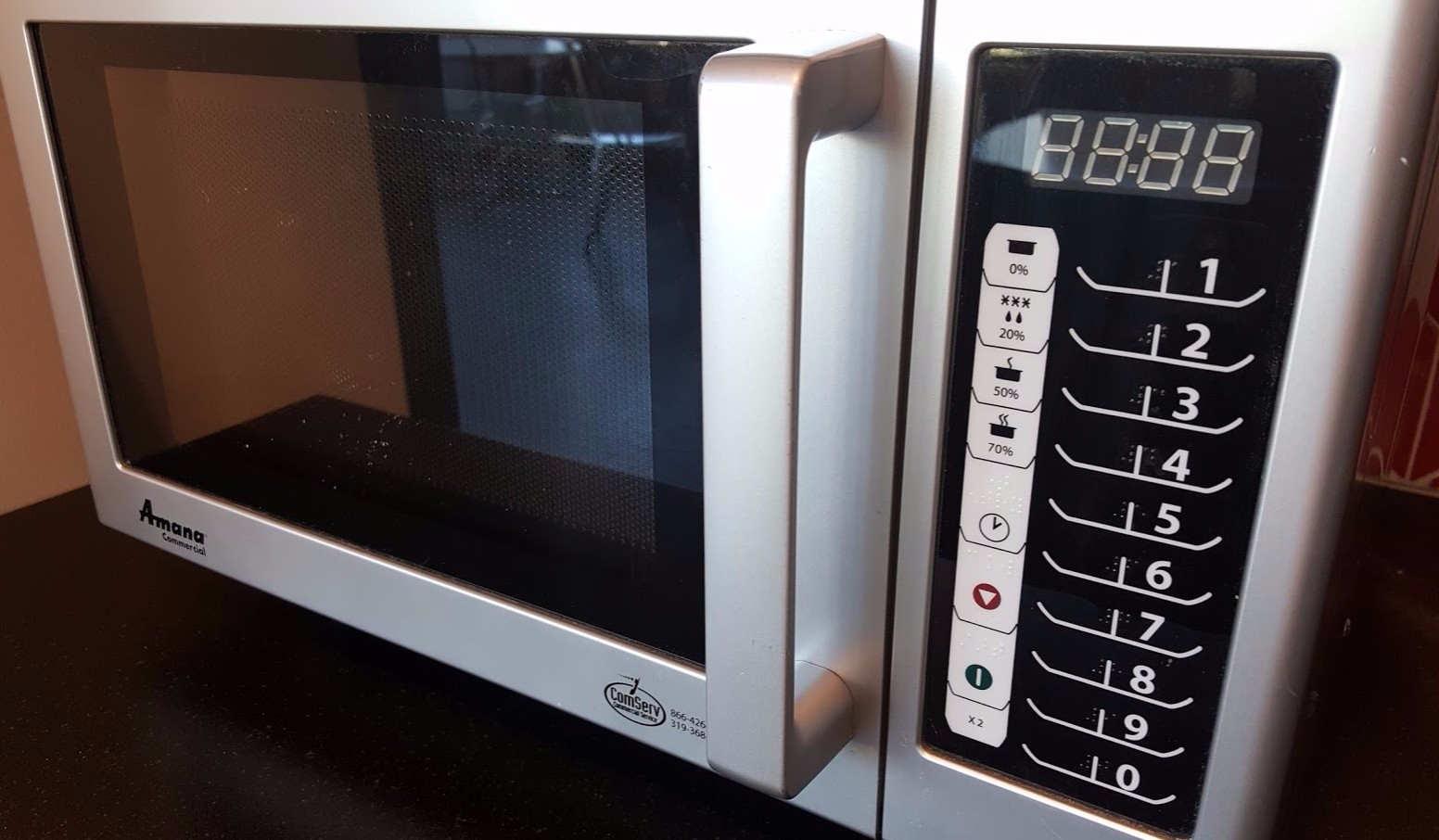
If you, like many others, think those numbers are for entering desired minutes or seconds – you are not exactly correct. In fact, the first three buttons will immediately turn the microwave on for 10, 20 or 30 seconds. Then the time interval suddenly increases by 15 seconds in each of the next two buttons; then for 30 seconds in the next two, and then for a minute on the last 3 buttons. Now, try to calculate which button to press, for example, for 2’30” (answer: none of those, there isn’t an option for that time).
Somewhere below there is an input button for entering custom time, but numbers on the right are so big and prominent that absolutely everybody goes straight to them, missing other options.
Even worse, there are Braille dots for the numbers on the buttons, meaning this product could be used by vision-impaired people. People with vision can see the display light up with the cooking time, but how can vision-impaired users ever know what those numbers on the buttons correspond to?
2. Lumosity. “Coming Soon” that never comes.
The online brain training and research company “Lumosity” tracks their users’ game performance with the Lumosity Performance Index (LPI). You will be given your score after playing any Lumosity game. Except for this one. In the Memory Match Overdrive, month after month, your LPI is always “coming soon”. I asked Lumosity’s Support and they explained: “Our data scientists decided not to assign an LPI to that game so your LPI won’t go down.”
The message on the results page should be simple and honest, instead of confusing “Coming Soon”.


What UX heuristics rule is broken:
- Visibility of system status. The system should always keep users informed about what is going on, through appropriate feedback within a reasonable time.
3. Old Navy: “Mysterious validation of the password hint”.
This is a screenshot of the Old Navy’s account registration page. There are visible requirements and validation for the “Create a password” field. There is also a “Password hint” field. The problem here is that the “Password hint” also gets validated, but validation criteria are unknown. I was getting error messages but there wasn’t a way to determine what the valid “Password hint” really is:

What UX heuristics rule is broken:
- Help users recognize, diagnose, and recover from errors. Error messages should be expressed in plain language (no codes), precisely indicate the problem, and constructively suggest a solution.
- Error prevention. Either eliminate error-prone conditions or check for them and present users with a confirmation option before they commit to the action.
- Recognition rather than recall. Instructions for use of the system should be visible or easily retrievable whenever appropriate.
4. New Microsoft Forms.
Office Forms is an online survey and quiz creator, available for Office 365 subscribers. In my opinion, it’s a useful app with a simple and clean interface. Except for one flaw. When adding your items to the reordering form you will be limited to a total number of 10 items. The problem here is that there isn’t any prior warning or information explaining this limit.
I had 12 items and only discovered the limit when I was at the 10th item, and close to completing the quiz creation task. Providing visible up-front information about this feature’s limit would help to save users’ time and frustration.


What UX heuristics rule is broken:
- Visibility of system status. The system should always keep users informed about what is going on, through appropriate feedback within reasonable time.
- Error prevention. Either eliminate error-prone conditions or check for them and present users with a confirmation option before they commit to the action.
5. Buttons in Hyatt elevators
The picture below was taken in the San Francisco Hyatt, but this button design is standard in all Hyatt hotels. I was looking at the display and thought that right-to-left positioned floor numbers in the elevator are a little confusing.
If you observe how new passengers are looking for their floor number in this display, you may notice their eyes start moving vertically from the bottom up, and not side-to-side. Maybe it’s because all floors are located vertically, and elevators move up and down, not side to side.

What UX heuristics rule is broken:
Match between the system and the real world. Follow real-world conventions, making information appear in a natural and logical order.
This post is continued:
References and suggested reading
- nngroup.com, “10 Usability Heuristics for User Interface Design“. 1995