
English is my second language. Years ago I thought I spoke well enough, but this was only until I moved to the US. Quickly I realized that I didn’t understand many things – slang, trivia, cultural references, abbreviations, antiquated words, a different system of measurements…
Recently I was reading an article on bbc.com “English speakers are the world’s worst communicators”. The authors pointed out that “in a group of people from different countries communicating in English it will be the native English speakers that are having difficulty understanding and making themselves understood – they often speak too fast for others to follow, and use jokes, slang and references specific to their own culture.”
But I think this applies not only to Americans or the English. The situation would be the same for any other native language speakers vs. non-natives.
People on the World Wide Web come from many different cultures and locations. Their experience is different and, just like it was for me years ago, sometimes confusing. The way to improve it for everybody is to design with empathy, ethics, inclusion, and respect. Here are a few examples:
Date and time
A date format that everybody understands.
Today is 09/05… is it September 5th or May 9th?
In most European countries that would read “9th of May”. In the US it’s “September 5th”. The European day/month/year format, also known as “little-endian form”, is something that creates a lot of confusion with visitors from the US being inherently ‘backward’ by American standards. And visa versa.
To eliminate any possible confusion on what should be shown first on any sites that have international visitors, the date should spell out the month.
Thus, today’s date is September 5, 2017
24 hour time cycle is universal.
The international standard for time is hh:mm:ss (hours, minutes, seconds) with 24-hour cycle, for example, 15:33:05. The 12-hour cycle with a.m. and p.m. abbreviations is rather unfamiliar for the majority of the world population, therefore could cause confusion.
Imperial system and Metrics
It’s been many years since I moved to the US, but I still get confused by the Imperial system of measurements sometimes. It’s difficult to determine the exact dimensions of an item, or the right amount of a product, or correct distance if measurements are provided in an unfamiliar format. If you can’t immediately estimate right dimensions, size, or volume then you have to use a converter, search, calculate… Think about international online shoppers, for example. Wouldn’t it be convenient and time saving for them to have alternative metric numbers provided? Here are a few simple examples:


*Images are from ikea.com and etsy.com
Typography
Easy to read typefaces.
It is a given that titles and text on the page should be readable. It’s even more important if you have international users. “Web typography includes good readability, scalability and a character that matches the nature of the website,” says Sabina Idler of Usabilla. I agree. But adding a “character that matches the nature of the website” could be a little tricky. Here are a few examples from that article that I wouldn’t use on the website. The reason – I can’t read the text. The task is even more difficult if you are not familiar with handwritten or artistic variations of letters:


*Images are from Sabina Adler’s article “15 Practical Tips How To Use Typography For Emotional Design on Usabilla.com
Avoid Ethnic typography.
There are more fonts with a “character” that, in my opinion, shouldn’t be used either. This group of fonts is known as Ethnic typography.
The problem with Ethnic typography is that the design reflects merely the designer’s preconception of what the typeface of a particular culture looks like. It may not correspond with the historic art of the culture but often reduces it to stereotypes and bias. Perhaps a question to ask – is this “Ethnic” typography actually used in the culture it portrays?
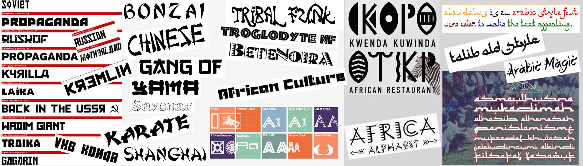
Use of Ethnic stereotypes prevents the public from seeing representations of minorities treated with the same respect as those of the dominant cultures.
Acronyms, jargon, slang
Spell out abbreviations.
I’m ESL. Years ago I didn’t know what this combination of letters stood for… I didn’t because ironically, I was ESL, or English as a Second Language speaker.
An acronym is simply a word formed by taking the first letter of each word in a phrase to create an abbreviation. Acronyms conveniently shorten our phrases and save our time. Some of them have become words on their own, and we may not even remember what those words (for example, ZIP, LASER, RADAR) stand for — or even that they stand for anything. There are hundreds of thousands of globally known ones, industry-related, or those that are made on the spot. Some are very common, they are used without any explanation or spelling the words out, because “everyone knows what they mean.”. They’re here; they’re here to stay.
While we’ve become so accustomed to shortening our phrases, there are a few things to consider:
- Similar abbreviations may refer to different terms in different industries. For example, according to abbreviations.com, acronym SPA has more than a hundred meanings.
- Abbreviated words could have different, and quite unexpected meaning in different languages: I remember reading an online article about how a few years ago the US National Association of Local Government Auditors (NALGA), changed its name to Association of Local Government Auditors (ALGA). It was because “Nalga” in Spanish means “butt”, which made the organization the butt (pun intended) of too many jokes.
- Even common English acronyms and abbreviations may not mean anything to international users.
No slang, please.

Recently I had a conversation with an exchange student from Japan and used the term “couch potato”, which is a very common term in American and British vernacular referring to a person who does not have an active lifestyle. For someone unfamiliar with the language the term was taken quite literally and caused a break in communication. Idioms, slang and unfamiliar terminology can cause miscommunication in our daily interactions, and this still holds true when we begin to think about inclusive user-oriented design.
Images, logos, iconography, colors.
While I was searching for examples of acronyms, I came across an article on mentalfloss.com that made me think about one more aspect of the international user experience – images and other design elements we use on the web. Here is an example of the header image from that article:

*Image is from Paul Anthony Jones’ article “23 words that are actually acronyms” on mentalfloss.com
The OK sign in this picture means that everything is fine. This is how it’s interpreted in most of the English-speaking world, as well as in several other countries. But this hand gesture in Brazil and Italy, as well as a few other countries is considered a rude gesture. An example of that is Richard Nixon’s visit to Brazil in the 1950s. He flashed the “Ok sign” to a waiting crowd upon arriving in Rio de Janeiro, who responded with boos.
Ironically, the same website also has a post on gestures that could be offensive in different countries.
Icons.
Just like images, icons and logos could be misused in a similar way. There are plenty of examples on the web of logos or iconography designs that have gone wrong. Aside from the obvious mistakes, there is a different issue: icons that bias.
The first image below was found in an article on thecapturegroup.com website. The article talks about how diversity in personalities fosters creativity, productivity, and workplace culture. Noticeably, there are only male figures portraying “leader”, “ambitious”, “confident”, “high achiever” personas in that illustration. The second image shows a collection of icons from Shutterstock and is another example of iconography that should be avoided.
*Images are from the article “How Diversity in Personalities Fosters Unmatched Workplace Culture” on thecapturegroup.com; and Stockphotos.com
Conclusions.
“International UX” is about diversity and inclusion. It’s about attitude and process that takes into consideration our cultural differences.
It is our responsibility as UX professionals to create an experience that is respectful, clear and easy to understand for everybody, no matter what culture, religion, or location.
References and suggested reading
- Ruben Pater. “The Politics of Design”. 2016
- bbc.com, “English speakers are the world’s worst communicators“. 2016
- abbreviations.com, directory and search engine for acronyms, abbreviations, and initialisms on the Internet.
- mentalfloss.com, “Why Is The Middle Finger Offensive?“. 2009
This article was also published on UX Planet.